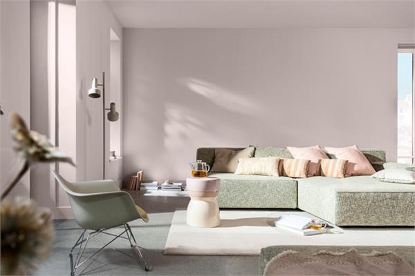
The pastel pink Sweet Embrace™ of AkzoNobel is the 2024 trend for both architectural and industrial applications.
The international coatings manufacturer AkzoNobel
has presented its 2024 colour of the year: Sweet Embrace™, a pastel pink shade inspired by soft feathers and evening clouds that contributes to create a calm and welcoming environment, resulting then ideal for architectural, domestic as well as industrial coating applications.
“Choosing Sweet Embrace as our Colour of the Year 2024 reflects our extensive research into global social, design and consumer trends for 2024. This research found that, in a changing environment, we are on a quest to belong. We need places that make us feel calm, but which also provide moments of joy. Identified by our in-house paints and coatings colour experts and international design professionals, these trends will influence how we choose our colours,” has explained Henri Bijsterbosch, the colour marketing manager for the Industrial Coatings business of AkzoNobel.
The Global Aesthetic Centre of AkzoNobel has then created three unique palettes (or “color stories”) driven by the themes of belonging, calm and joy encapsulated by the newly Sweet Embrace in order to help consumers choose on-trend and harmonious colours reflecting their unique personalities. As a matter of fact, these colour stories provide an essential toolbox for customers working in the construction and DA markets
that are looking for on-trend coil and extrusion coatings – thus helping their projects to stand out.
“With society in a state of flux, we are reassessing how we cope with the world. Starting at home, we are looking to create our own ‘special somewhere’ that grounds us in our individual memories and relationships. Our Colour of the Year Sweet Embrace and its three complementary color palettes can help us achieve that. They enable us to personalise our environments to fit the times we live in as well as bringing a sense of stability and moments of joy to our spaces,” has added Heleen van Gent, the creative director of the Global Aesthetic Centre of AkzoNobel.
On-trend colours, textures and special effects have been designed for the aerospace, automotive, consumer electronics, metal furniture, lighting, cabinetry, flooring, building products and architecture markets, as well as decorative paints. The three colour stories are:
- A warm colour story: it reminds of home, a place that feels comfortable and safe by combining shades of stone, soil and clay.
- A calm colour story: it evokes thoughts of nature and the essence of life by bringing together the soft greens and blues of the woods and the sea.
- An uplifting colour story: joyful colours that put a smile on faces, inspiring imagination and creativity with dreamy lilacs, fluid greys and modern yellows.
“Color of the Year often inspires long-term design partnerships in our businesses. We combine consumer trend insights with in-depth colour and materials research and market analysis in our ColourSurfaces trend collection to bring market-specific solutions to our customers and work together with them on the perfect finish for their projects,” has commented Jan-Piet van Kesteren, the director of the Decorative Paints business unit in Europe, Middle East and Africa.
“Our high-quality coil and extrusion products like TRINAR™, CERAM-A-STAR™ and POLYDURE™ are some of the bests performing in the market. They are widely specified and used for their excellent performance, durability, color and gloss retention. Our global color experts create these colours in the right product needed for the job in hand. They can also help customers find close-matching and complementary colours from a standard assortment,” has concluded Bijsterbosch.