Featuring softened hues and neutrals that aim at serving as a release for over-stimulated, weary consumers, PPG has unveiled its 2021 Palette of the Year "Be Well".
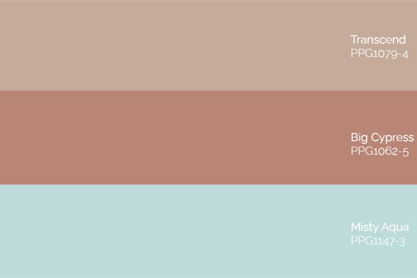
The PPG 2021 Palette of the Year "Be Well" consists of hues Transcend, Big Cypress and Misty Aqua.
Showcasing natural hues, the palette is intended for consumers who want to embrace mindfulness and prioritize wellness in mind, body and soul. It aims at emulating both the optimism felt in nature and soothing nostalgia, in an era where normality as we knew it is no longer and mental and physical well-being have become even more pivotal.
"With the world sheltering in place for the better half of the year, we have begun to crave human connection and embrace simple activities, including walking, hiking, baking and gardening," said Dee Schlotter, PPG Senior Colour Marketing Manager, Architectural and Industrial Coatings. "This organic and hopeful palette represents what we have been longing for after decades of overstimulation and overconsumption - simplicity and restfulness."
The colours
*
Transcend, a mid-tone oatmeal-coloured hue that draws on earthy influences and nostalgia, grounds the palette.
Big Cypress, a shaded ginger with persimmon undertones, is the equivalent of a big, comforting hug for your home.
Misty Aqua, a watercolour cerulean blue, provides an unexpected pairing of freshness against the other warm, earthy tones.
Used according to the 60-30-10 design rule - 60% of a room should be the dominant colour, 30% as the secondary colour and 10% as the accent - Transcend, Big Cypress and Misty Aqua pair well with greenery, blonde or natural brown-toned woods and layers of texture in the form of rattan, linen, velvet and woven textiles like pillows, blankets and rugs.
"When the world experiences events that cause unrest, anxiety and grief, we tend to naturally gravitate toward compassionate colours that allow us to create a personal retreat from the world," said Schlotter. "These comfort colours are similar to comfort foods - both offering a certain sense of familiarity and normalcy when facing the unknown."
The creative process
The increasing need for kindness, human connection and mindfulness were recurring themes at PPG's Global Color Workshop.
This annual event brings together more than 30 PPG global colour stylists from the automotive, consumer electronics, aerospace, and home paint and stain industries.
Over the course of several days, the stylists analyse the runway, lifestyles, demographics, geographies, global events and cross-cultural societal inspirations to determine what colours will resonate and represent the PPG global colour forecast, including the PPG Palette of the Year.