The breezy and tranquil blue shade Upward has been selected as colour of the year 2024 by Sherwin-Williams Coil Coatings to bring a clean slate and a sense of possibility to any setting.
The Coil Coatings division of the international paints manufacturer Sherwin-Williams
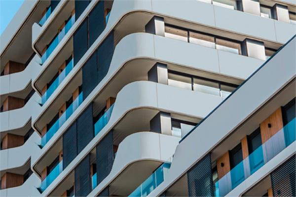
has recently presented its new colour of the year 2024: Upward, a breezy and tranquil shade of blue that brings a clean slate and a sense of possibility to any setting, allowing creativity to soar.
Each year, Sherwin-Williams brings together a panel of colour-minded experts who combine research, analytics and trend tracking to conceptualise not only what the markets want, but also what they need. From this methodical analysis, they then determine how the colour space is evolving and consider which enhancements, effects and finishes could be employed in the various markets for long-term use. As a matter of fact, it is important to establish that a colour or a palette for the industrial market is sustainable for years to come, since longevity is fundamental.
The previous colours, the mid-tone Evergreen Fog and the light terracotta of Redend Point, lightened up the palette of the company. Upward continues the shift: the new airy hue works as an accent but could also serve as a base neutral. For instance, when paired with darker tones such as Urbane Bronze and Naval, the combination behaves as two neutral tones working together.
“Color of the Year is researched across our organization. This team, which represents each of our business units, gathers throughout the year to share updates on their research of trends and colour. We are taking those effects and bringing it to an application that people do not typically expect. It is an inspiration thing: we push peoples’ expectations and inspire them to consider other options,” has stated Brynn Wildenauer, the architectural colour designer of Sherwin-Williams.
By using the available range of finishes and effects, the colour team pushes expectations and helps customers to break out of a rut of muted palettes. For Upward, options include base, low gloss, high gloss, texture, Fluropon® Classic II, Kameleon, Nova, WeatherXL™ and WeatherXL Crinkle. Applying Upward with a wood grain might be more residential, for example, while combining it with a mid-tone grey in a concrete print could make a statement on a commercial building. In the agricultural market, it might be the siding of a barn or a garage door, whereas in commercial buildings, a colour like Upward could be used as a small accent in siding or on a larger scale on panels.